
 ‘Tis the season for hot cocoa, sweaters, and for many of us, two very specific colors. Red and green, the aesthetic workhorses of the Christmas season, appear on everything from cookies to coupons — so much so that the combination on its own has become somewhat synonymous with the holiday, and not much else. Is it possible for the festive pair of hues to thrive outside of the holiday season?
When it comes to branding, choosing a color palette can be scary. It’s a huge commitment, and it’s common for business owners to feel inclined to settle into something safe or expected. Unfortunately, those palettes often fall flat and translate as indecisive. Playing it safe is actually just as much or more of a risk for a brand to be perceived negatively or not at all, in comparison to something out of one’s comfort zone. The brands whose identities truly reflect a unique personality are the ones most likely to shine with confidence.
Even for a palette with a highly established, holly, jolly reputation such as red & green, representing a brand without the baggage is totally possible if designed strategically, thoughtfully, and tastefully. We’ve pulled together some examples of brands whose palettes represent their unique personalities so well that they avoid the holiday association all together.
Beverages
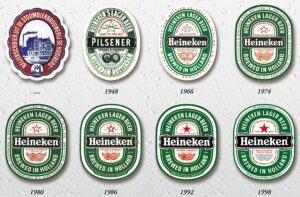
Heineken
Founded in 1864, Heineken has gone through a long history of brand evolutions. Along with the badge and banner elements in the logo, the color palette, established as early as 1948, clearly portrays the timeless brand appeal of the beer.

Mountain Dew
What’s interesting about Mountain Dew’s branding is that the simple idea of a mountain’s dew sounds tranquil, natural, and ethereal. On the contrary, the company has branded itself as quite the opposite — daring, aggressive, and, just like the juxtaposition of its two complimentary brand colors on the color wheel — extreme.
Food
![]()
Chili’s Grill & Bar
For the Chili’s logo, the color choice is obvious based on their namesake — the colors of a chili pepper.
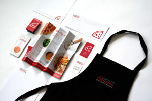
Ohio City Pizzeria
For other food brands, heritage can play a part in the color palette. When designing Ohio City Pizzeria’s brand identity, we were inspired by the colors of the Italian flag.
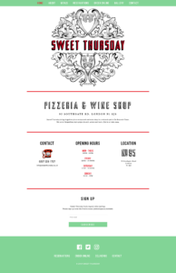
Sweet Thursday
This is a clever take on the heritage approach — Italy-inspired, with an ownable and modern twist.
Lifestyle
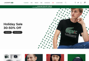
Lacoste
Lacoste’s brand is a great example of how red and green can represent something far different from Christmas, beverages, or food. Instead, it screams “classic” — plain and simple.
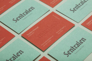
Sentralen
Oslo, Norway’s creative workshop center has nailed its identity. The red and green hues speak to the artistic and eclectic foundation of the brand, but with a sophisticated and tasteful voice.

Happy Collections (Moscow)
The use of red and green in this identity brings an air of uniqueness and confidence, to an otherwise luxury-focused brand aesthetic. It says “I’m affluent, but I’m fun…an appealing and approachable balance!”
In conclusion, a red and green palette isn’t just for Christmas. With careful thought behind the hue, saturation, and contrast, and accompanied by a strong brand system, this combination can represent a broad array of brand personalities. Now, bring us some figgy pudding and a Heineken beer.